Wednesday, 31 October 2012

Contents page analysis - Q


  • This contents page for Q magazine covers a double page. Over these two pages the top halves are dominated by medium sized images relating to highlighted articles, and the bottom halves feature the regular articles and the cover story, without any attaching images. In general this contents page has a very clean and tidy layout, different sections are separated by lines, and although some images and text overlap, it is not too overcrowded or busy. Objects and text on the page are presented very squarely, nothing has been rotated at an angle, and this helps with the magazine continuing its professional and sophisticated style.
  • There are many images on this contents page. Pretty much all images used associate with the one article they are presented with, and help the reader visually identify the contents of that article. Presenting images in this way makes the information simple to understand for the reader and may attract them to certain areas of the magazine. These images vary in size, shape and style adding variety and diversity to the page.
  • The text on this page follows a consistent layout of article titles being in red and the info being smaller and in black. However, you notice how the article titles that are presented with images have larger font sizes and are in bold, suggesting these are the main articles designed to attract the reader to the magazine. Category titles such as ‘cover story’ and ‘regulars’, as well as the page numbers on this contents page are presented in boxes, ensuring they stand out from other text and are easy to read, making that information more accessible. The page title is simply ‘contents’ which is traditional and uncomplicated. Underneath this title you can see the magazine name and dateline which are in quite a large font, but this guarantees the reader will see it.
  • The colour scheme for this contents page is quite basic but again, is consistent with the front cover. The contents page has a white background which makes information on top of it very easy to read, especially and all text is in red and black (bright, contrasting colours). This black, white and red theme also adds to the clean, fresh style of Q magazine and this small amount of different colour ensures the reader does not get distracted from the actual content. 

Monday, 29 October 2012

Contents page analysis - Kerrang!


  • The Kerrang! contents page covers one single page. The general structure is quite ordered and organised. There is one main image on the left with most text on the page taking on a list arrangement on the right. This features one column separated by categories such as ‘news’, making the information easy to understand and accessible. Also visible on the page is a competition (over the main image), editors letter (in boxing device under image) and subscription info. A banner is used to separate the page title and date line, catching the readers attention and making it clear to read.
  • There is pretty much just on image on this page and it takes up most of the space, meaning the reader is forced to focus on one single area and is not distracted by other elements on the page. This main image is clearly very posed and taken from a photo shoot with artificial lighting, it also relates to the competition featured over the image and this will further engage the reader with an incentive of winning something. There is a speech bubble on the image containing a made up quote which I think helps relate the image and contents page to its target audience, as it gives the photo a more fun and playful feel. There is also two small images accompanied with the editors letter and subscription info, adding further interest to the page.
  • Most text on this page varies in font size, type and colour which ensures information is easily accessible and interesting to read. All article names are bold and in capitals making them stand out over the article info which is in lowercase and a much smaller font size. Page numbers next to the listed articles are in a separate colour (red) so are quick and easy to identify. The title of the page is ‘Kerrang! Contents’ and is quite large on a banner at the top of the page, it is also in the same unique font/design as the masthead so would be recognisable to the reader and subconsciously reminds them what magazine they’re reading. Language used on this contents page such as ‘rad-looking’ help give the magazine an identity and further relate to its target audience. Other text visible on this contents page include the date, issue number and credits for the front cover.
  • In terms of the colour scheme for this contents page, it very much follows on from the front cover and uses the same mixture of yellow, red, black and white. These colours suit the genre of the magazine and make the magazine appear multi-gender friendly for its genre. Having the background white with black text also makes the text easy to read.

Saturday, 27 October 2012

Contents page analysis - NME


  • The general layout of this contents page for NME magazine is quite structured. Everything is very square and ordered. You can see that three main columns have been used, making the contents easy to follow and appealing to the eye. The contents covers one page, and most articles featured are accompanied by a photo and a quote of some sort. There is also a ‘plus’ section which features the regular and less popular articles. In the left corner you can see an advert for a subscription to NME which may catch the reader’s attention when they see the words ‘save’ and ‘only’. 
  • There are many images featured on this contents page, all are accompanied by related text about certain articles. The biggest image is in the centre of the page and paired with the largest text, suggesting this is the main article. The images on this contents page are informative to the reader and help the contents page become easily accessible and simple to understand. It also may attract the reader to certain articles of interest as they have a visual guide to the contents of the main articles, therefore keeping them engaged and involved.
  • There is quite a few different types of text visible on this contents page. Included is the title ‘Inside This Week’ which replaces the traditional ‘contents page’, making NME look edgy and original. The name of the magazine is not mentioned anywhere other than the subscription advert in the right corner, but regular readers would recognise the style and relate it to NME. Also visible on this contents page is credits for the front cover (in small print on the left hand side) and a date line (situated below the title). The language used on this contents page further suggests that the target audience is 16-24 year olds, as it is very explicit and graphic (e.g. ‘fucking’ and ‘vomit’). It may be that this language was restrained from the cover because it would be displayed to many members of the public including young children, but it is suggested by looking at the contents page that it will be a common theme throughout the magazine.
  • The colour scheme of this contents page is quite plain. The background is white, and the other colours used are extracted from the front cover, such as red, yellow and black. Following the colour scheme from the front cover gives the magazine consistency and a uniform appearance. The colour scheme on this page helps the reader focus on the content rather than the background and general design.

Tuesday, 23 October 2012

Front cover analysis - Mixmag


When you first look at this front cover of Mixmag magazine, you notice the main cover line ‘Steve Aoki’ as it is centred and bold. The text is in two colours (white and red) with a black background surrounding it. These contrasting colours cause the cover line to stand out above everything else and look striking. The other cover lines also follow this colour scheme and style of presentation (colour fill around text), as well as all the letters being capitalised, adding emphasis. However, the cover lines tend to differ in font types, which I suppose adds a bit more variety to the magazine, but it’s still kept looking fresh and modern as the fonts used all have a similar crisp, trendy style. This design is further emphasised by the tidy presentation of the cover lines - they look ordered and organised. Language throughout the cover lines such as ‘forever’, ‘massive’, ‘dying’, ‘special’ and ‘flying’ are all dramatic and over the top, but engage the reader and encourage them to pick up the magazine. The masthead takes up most space at the top of the magazine and is slightly covered by the main image, but it is still very much recognisable due to it’s unique and easy to identify design. In general, the colour scheme on this front cover is mainly made up of red and black, with white being the most dominant colour. The white is what helps with giving Mixmag magazine it’s chic, up to date appearance, as it is a colour that can have connotations of cleanliness and purity, and these three colours as a whole make the cover look vibrant and energetic. The selling line for this magazine is positioned above the masthead and reads ‘The world’s biggest dance music and clubbing magazine’, which automatically informs you of the genre of magazine and is also a powerful statement that captures the reader if they realise it may be of interest to them. The dateline, price, website and bar code are all positioned together in the bottom right corner of the cover, making them easily accessible to the reader and allowing them to be fully informed with no difficulty. The overall layout of this front cover is neat, spaced and uncluttered, I think this helps the magazine to appeal to an older, slightly more mature audience, as it makes the appearance of the magazine sophisticated and trendy.

The main image on this cover captures Steve Aoki, an electro house musician and record producer. The photo looks as if he has been captured mid-jump as his hair is flying about and his knees are slightly bent. This, along with his facial expression, makes the image look animated and dynamic. His hand gestures seem to put him in an angelic type pose, he looks respected and powerful. The shot includes his whole body and ensures he takes up the full length of the magazine and is the centre of attention. In terms of clothing, Aoki is shown wearing slightly unusual attire, including a belted jacket with locks on, and non-matching shoes. However you can see a theme occur in the colours of his outfit, as the jacket is covered with the american flag, and the shoes match also - I know Steve Aoki is from America and so this suggests he could be promoting his country and its music. Overall his style comes across as slightly quirky and unusual, but at the same time, hip, cool and trendy - this is going to attract people of a similar style to the magazine. The background to the main image is plain, this ensures the reader is not distracted by any further images and also keeps the magazine looking uncluttered.

From looking at this front cover I would say the overall style of this magazine is fresh, trendy and sophisticated. The target audience seems to be 16-24 year olds, suggested by the genre of music (dance/clubbing), clean, stylish layout, and professional design. The magazine seems pretty multi-gender friendly and more focused at appealing to an audience with a particular interest in dance/clubbing music.

Monday, 22 October 2012

Front cover analysis - Rock Sound


The main thing I notice when I first look at this cover of Rock Sound magazine is the image, as it takes up most of the space. Second to this, my attention is taken by the masthead, which is a vibrant pink colour, contrasting to the bright yellow background, making it stand out. The cover line layout on this magazine is quite random, they are all around the edge of the image and at varying angles, making it look less structured. Some are in round boxing devices and others have a white background colour, but they all follow the same blue/pink/black/yellow/white colour scheme and have similar font styles, ensuring the magazine follows a fixed style and doesn’t look too messy. It is suggested that ‘All Time Low, Don’t Panic… they’re back!’ is the main cover line due to the fact it is the largest of all the cover lines and takes up the most space on the magazine, second to the masthead and main image and so this ensures it is your main focus over the others. Language such as ‘exclusive’, ‘special’, ‘now’, ‘dramatic’ ‘need’ all have high impact on the reader and suggest it is a must have. Similar to Kerrang!, the dateline, issue number and price are all positioned in the bottom right hand corner along with the barcode which is helpful to the reader as they only need to look in one place to be informed of that type of information. However, it doesn't take up much space on the magazine and so doesn't detract from the actual magazine content. Similar to the previous two magazines, the layout of the cover lines does not follow the traditional left third format taken by most magazines selling in western countries, but this may be because the magazine is trying to look more edgy and unusual. The overall layout is quite busy, and there is a lot going on, but I think this reflects the genre of music the magazine is representing, rock.

The main image on this front cover captures all four members from rock/pop band All Time Low. The lead singer of the band is positioned in front of the other members, as well as being enlarged. The image itself is a medium close up shot and does not cover the whole background of the magazine - it is in fact presented as some sort of cut out on top of the magazine, giving it a collaged style. The people featured in the image are wearing casual attire (hoodies, T-shirts and jeans), their style has a cool vibe and would be appealing to a young teenage audience. The main image helps the magazine appear young and fun, due to the styling, facial expressions and hand gestures.

From looking at this cover I would say the overall style of Rock Sound magazine is youthful and hip. I would say the target audience of this magazine is 15 years or younger, due to the unstructured layout of the magazine, bright and vibrant colour scheme, and the styling of the main image. The pink and yellow from the colour scheme does suggest that the magazine is trying to appeal to more of a female audience, but there is no obvious indication that it is aimed at a female only audience. I would say this cover of Rock Sound magazine appeals to young people with an interest in current mainstream rock bands and alternative music.

Saturday, 20 October 2012

Front cover analysis - Q


When you first look at this front cover of Q magazine you first notice the masthead, as the Q is in white and has been placed on a red background, so these contrasting colours make the letter stand out and look bold. The masthead itself is very simple, but easily recognisable to a reader as it’s so striking. The cover lines on this magazine are presented in an organised and consistent layout so when you look at the magazine it is tidy and legible. All cover lines follow the same theme of font, and capital letters are used to emphasise certain words throughout. The content of the cover lines contains information from artists of varying genres such as punk, pop, alternative and electronic, but the focus is mainly on rock. You notice the main cover line is ‘Mission Accomplished! Noel, how he did it his way…’ due to the fact it has a different style to the other cover lines and is very big in comparison. Language throughout the cover such as ‘murdered’, ‘starving’, ‘mental’ have controversial connotations and suggest the magazine is aimed at a more mature audience. Quotes featured on the speaker are all very opinionated and slightly shocking, this kind of text engages the reader and they want to find out more. The selling line of this magazine is visible underneath the masthead and reads ‘The world’s greatest music magazine’ which is a positive and powerful statement that would stick in someone’s mind. The dateline, price and bar code are all positioned together in the bottom left corner of the cover, making them easy to find but not too distracting from the magazine content. The whole front cover follows a consistent colour scheme of black, red, gold and white, which together grab your attention due to the fact they are bold and striking, gold also has royal/grand connotations, whilst black suggests rock and attitude, and red creates a statement. The overall layout of this front cover is spaced out, ordered and clean, which I think helps it appeal to a maturer, more sophisticated audience, and also puts more focus on the main image as the magazine looks less cluttered.

The main image itself captures Noel Gallagher. He is shown leaning against a speaker with his arms folded and a stern facial expression. Being positioned in this way shows him as a powerful figure who has great confidence and pride, overall creating this ‘tough guy’ image which some could interpret as arrogant. The shot includes his whole body and seems to be taken from slightly below Gallagher’s height, which could be intimidating to the reader but also presents him as an dominant, manly figure. You can tell the photo has been taken in a studio due to the use of artificial lighting and background, this enhances the magazine’s clean, professional appearance. In terms of Gallagher’s clothing, he is pictured wearing quite casual attire (jeans, shirt) paired with a leather jacket. This leather jacket could have connotations of deviant and rebellious behaviour and is very much related to the genre of rock music. The setting behind the main image is a plain grey background which becomes lighter in colour as it reaches the subject, focusing the reader’s full attention on Gallagher.

From looking at this front cover I would say the overall style of this magazine is stylish and mature. I would say the target audience is definitely 16-24 year olds, suggested by the language used being slightly explicit and controversial, the magazine layout looking clean and professional, plus the colour scheme creating a sophisticated appearance. In terms of gender, I think this magazine comes across as pretty multi-gender friendly - cover lines focus on a mixture of female and male music icons, although the colour scheme is not particularly feminine, it would be stereotypical and assuming to presume they would not read this magazine because of that. In general, this magazine cover suggests Q is designed to appeal to an audience with a general interest in popular rock, indie and alternative artists.

Front cover analysis - Kerrang!


When you look at the front cover of this Kerrang! magazine, I first notice the main cover line in the centre which is boxed in red. This makes it stand out against all the other cover lines and draws your immediate attention to it, enhanced by the fact the ‘O’ in ‘photos’ is an image of a lens and black in colour, contrasting with the red. The other cover lines appear all over the magazine apart from one section which features the main image. Most of the cover lines are presented in a photo frame style and each focus on one artist/band, giving the magazine a cluttered yet collaged style. Further information is displayed in banners at the bottom and top of the magazine, and you can see a boxing device on the left side which says ‘WIN!’, suggesting a competition/giveaway of some sort, attracting readers. The masthead is partly covered by the main image, but it is still noticeable because it’s in a contrasting colour to the background. Regular readers would recognise the magazine’s masthead by the unique font you can see on the letters that are visible behind the image. The magazine has a consistent colour scheme of black, white, red and yellow which is very much multi-gender friendly, but also reflects the genre of the magazine being punk/rock. Black is definitely the most prominent colour on the cover, which is a colour that tends to have negative connotations. It suggests the magazine has attitude and a dark side to it. But then again, language on the cover such as ‘awesome’, ‘win!’ and ‘loads’ all have positive connotations. The dateline, issue number and price are all positioned in the bottom right hand corner along with the barcode which is helpful to the reader as they only need to look in one place to be informed of that type of information, but it small and very unnoticeable so doesn’t detract attention away from the magazine. Like NME, the layout is not following the traditional left third format taken by most magazines selling in western countries, but that kind of layout wouldn't work with the busy, unstructured style taken by Kerrang! magazine.

The main image on this magazine front cover captures the leading member from rock/pop band Paramore. The member is female, but you can’t see much of her attire due to her body being covered by the main cover line, so the emphasis is more on her hair/make-up and facial expression. Her hairstyle and make-up look quirky and bold due to the bright, out-there colours, and her expression comes across as fun and playful. The shot itself is a medium close up, but it is only really the subject’s head and shoulders that are in view. You can see the image has been placed on top of a plain black background, and this furthers the montage style of this front cover. You can also see a shadow has been added to the edge of the main image, giving the illusion that the subject matter is coming off the cover, and further aiding in gaining your full attention.

From looking at this cover I would say the overall style is messy but fun. My impression is that the target audience is 15 years and younger due to the chaotic/cluttered layout making it look slightly less professional that other music magazine brands. The language is also pretty positive and family friendly, although it it still clear due to the colour theme and edgy photos that the genre of magazine is rock. I think this magazine is pretty multi-gender friendly, although the colours are slightly more masculine, the main image features a female rock icon, and lots of the male bands featured will attract a female audience. In general this magazine front cover is going to appeal to an audience with an interest in rock music.

Tuesday, 16 October 2012

Front cover analysis - NME


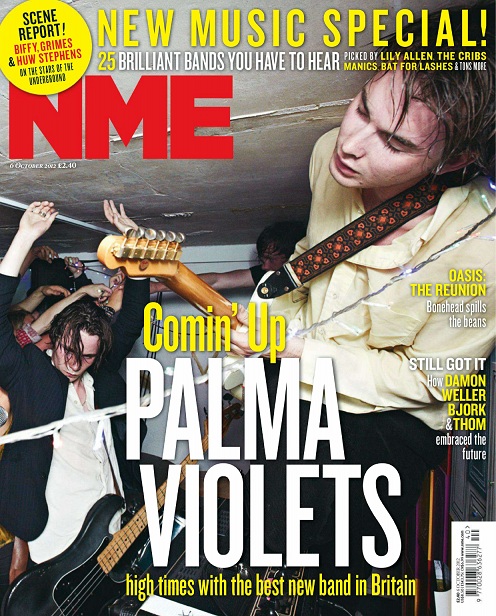
When you look at the front cover of this NME magazine you first notice the masthead, as it is in a contrasting colour to the main image and therefore looks bold and clear. You then notice the main cover line about a band named Palma Violets. The band name is in capital letters and takes up most of the centre of the magazine, ensuring that it captures your attention and is the main focus. All the cover lines use similar fonts and a white and yellow colour scheme, ensuring there are not too many different variations of colour and pattern on the page which could detract from the actual content. Language such as ‘brilliant’, ‘best’, ‘new’, which feature on the cover all have positive connotations and sound fresh and vibrant. You can see the dateline and price underneath the masthead, which are small due to the fact they are not very significant features. Interestingly, the cover lines are positioned in the centre and to the right of the cover, therefore not following the traditional left third format taken by most magazines selling in western countries, but I think this is due to the text trying to fit around the image behind it. The layout is also quite spaced out, but I think this is again because the focus is trying to be put on the main cover image.

The main image itself seems to capture a scene from a party of some sort, suggested by arms in the air, quite dark lighting, sweat, guitars etc. The people featured in this photo appear to be mainly young adult males. The two main subjects are wearing smart/casual attire - shirts, blazers with jeans. This, along with the fact that the background looks quite plain, but rugged, rough and authentic (not taken in a studio), would suggest an intimate house party/gig of some sort, making the magazine appear young, energetic and fresh. The shot looks like more of a snapshot than a fully professional photograph, making the it also seem edgy and original, further enhanced by the fact that the framing has the main subject at an interesting angle.

From looking at this cover I would say the overall style of this magazine is raw and edgy. I would say that the target audience of this magazine is definitely 16-24 year olds, due to body language and setting in the main image indicating alcohol consumption and language such as ‘high’ potentially suggesting drug use. It also seems slightly more appealing to a male audience due to the main image and language used, although many other aspects such as the colour scheme and layout are multi-gender friendly. This magazine cover makes NME magazine appeal to an audience with an interest in current artists from pop/rock genres.

Tuesday, 9 October 2012

College magazine evaluation


I am now going to evaluate my preliminary task – the front cover and mock up of a contents page of a college magazine. During this task I had the chance to develop my practical skills before I start the main task of designing the front page, contents page and double spread article of a music magazine. I found this task interesting and was able to learn a lot about the skills and processes involved in creating the basics of a magazine. I will now have increased confidence when designing my music magazine, as I am able to analyse the positive and negative features of my preliminary task and improve on certain qualities.

My magazine is aimed at students of a college, so mainly 16-19 year olds. The magazine should be appealing to all college students, therefore males and females, and people of all ethnicities and social positions. This magazine in particular focuses on updating students of current affairs around the college, helping them with revision tips etc., as well as offering them the chance to win prizes. I would say this magazine is aimed at students more than teachers, but it could still be appealing to an older audience (like teachers and parents), if they were interested in learning about the current issues and social events in the college. I am definitely happy with the model I have used for the front cover of my magazine. I believe she will appeal to a variety of people, due to the fact she is aesthetically pleasing and looks happy and content. Her choice of clothing is casual yet stylish, and her glasses suggest she is intelligent and bright. Therefore, to any outsiders, she creates a positive view of the college being academic, friendly and inviting.

Before I started this task, I did have experience of using digital cameras, Macs, and Photoshop, but I found that during this task my skills on Photoshop in particular increased and I learnt new techniques and methods. I would say the main skills I learnt were improving my use of the clone tool, and experimenting with different styles of text. I would consider maybe working on further experiments in Photoshop when I start my actual task, as I currently feel slightly limited in what I can do.

Overall, I would say my preliminary task has been a success. I am happy with the finished product and feel much more confident about my music magazine. However, I can see areas for improvement on my magazine, including adding some more graphics and photos to the contents page, as well as creating a less structured layout. Other people I have asked feedback from said I should add further information to the cover lines on the front cover to make them more communicative, and also add extra cover lines to make it more engaging. I think the main positive outcomes from my magazine seem to be its clean, professional style and appealing main image. Others said they liked my colour scheme and use of fonts.

Tuesday, 2 October 2012

Development of pre lim task

I'm in the middle of designing my front cover at the moment and think it's going okay. Here are a few screenshots showing how I'm getting on:


Current design of cover lines

Masthead

Layers in Photoshop