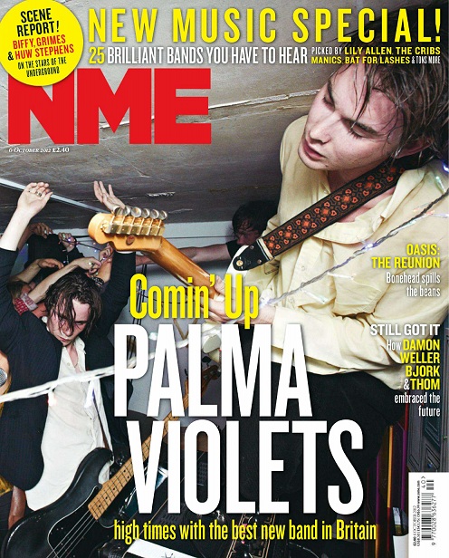
When you look at the front cover of this NME magazine you first notice the masthead, as it is in a contrasting colour to the main image and therefore looks bold and clear. You then notice the main cover line about a band named Palma Violets. The band name is in capital letters and takes up most of the centre of the magazine, ensuring that it captures your attention and is the main focus. All the cover lines use similar fonts and a white and yellow colour scheme, ensuring there are not too many different variations of colour and pattern on the page which could detract from the actual content. Language such as ‘brilliant’, ‘best’, ‘new’, which feature on the cover all have positive connotations and sound fresh and vibrant. You can see the dateline and price underneath the masthead, which are small due to the fact they are not very significant features. Interestingly, the cover lines are positioned in the centre and to the right of the cover, therefore not following the traditional left third format taken by most magazines selling in western countries, but I think this is due to the text trying to fit around the image behind it. The layout is also quite spaced out, but I think this is again because the focus is trying to be put on the main cover image.
The main image itself seems to capture a scene from a party of some sort, suggested by arms in the air, quite dark lighting, sweat, guitars etc. The people featured in this photo appear to be mainly young adult males. The two main subjects are wearing smart/casual attire - shirts, blazers with jeans. This, along with the fact that the background looks quite plain, but rugged, rough and authentic (not taken in a studio), would suggest an intimate house party/gig of some sort, making the magazine appear young, energetic and fresh. The shot looks like more of a snapshot than a fully professional photograph, making the it also seem edgy and original, further enhanced by the fact that the framing has the main subject at an interesting angle.
From looking at this cover I would say the overall style of this magazine is raw and edgy. I would say that the target audience of this magazine is definitely 16-24 year olds, due to body language and setting in the main image indicating alcohol consumption and language such as ‘high’ potentially suggesting drug use. It also seems slightly more appealing to a male audience due to the main image and language used, although many other aspects such as the colour scheme and layout are multi-gender friendly. This magazine cover makes NME magazine appeal to an audience with an interest in current artists from pop/rock genres.

No comments:
Post a Comment