
Friday, 30 November 2012
Thursday, 29 November 2012

Thursday, 22 November 2012
Introduction and aims
The target audience for my music magazine will be female and male young adults. I plan to make my magazine appeal to students who like to go clubbing and are interested in the dance/electronic genre and its current, most popular and up and coming artists. Therefore, in terms of an age group, I would say my magazine is targeted at 16-24 year olds. If I were to discuss this in terms of psychographics, I would say I am aiming to appeal to aspirers who like designer goods and are motivated by how others see them as the dance/clubbing genre is not necessarily mainstream and this particular genre is able to be portrayed as a glamorous and sophisticated. I therefore plan for the overall style of my magazine to be clean, stylish and professional, with a slight urban edge. I would like my magazine to be glossy as I think it will suit the genre and appeal to the demographic of my magazine being mainly aspirers (people motivated by how others see them). I think this professional style should also reflect slightly in the price, yet I do not want to exclude students on a budget from my target audience and therefore I will be choosing a mid-range price, something between £2.50 and £4.
The inspiration for my magazine mainly came from two current music magazines on the market, ‘Q’ and ‘Mixmag’. Although Q magazine was not related to my chosen genre, it reflected the polished style I wanted for my magazine, and Mixmag helped me understand how the dance/clubbing genre can be portrayed in a music magazine. I would say I was also inspired by the information I gathered from my questionnaire, as it helped me form a clearer idea of what would appeal to my target audience and what features I should include in order to make my magazine successful. From what I understood from analysing Mixmag magazine and asking my target audience, features of my magazine should focus on reviews of popular gigs, clubs and festivals, interviews with current and up and coming DJs and artists from the dance/electronic genre, and articles on inside info/gossip from the industry that will keep readers interested and engaged. The artist I will be focusing on in this issue of my magazine will be an up and coming female singer whose music and interest is in the dance/electronic genre. This will affect my magazine in terms of the main cover line on the front cover, the main article inside the magazine, and the main images. I will need to promote and mention this artist frequently throughout the magazine so they become the main point of focus for the reader.
I plan on the images I use throughout my magazine to reflect the energy and movement of dance music as a genre. On the front I will most likely just have one single main image relating to the artist featured in the magazine. On the contents page I plan on having a few images that anchor to certain articles I want to attract attention to. This may involve having professional shots of artists featured and more snapshot type photos from gigs/festivals. On the double page spread article all images will relate to the artist featured. I am going to have a main image taking up most of the space, which needs to look professional and so taken in a studio. Further images could be of the artist performing etc so could have a more casual style. The main model I will be using for these images will be the featured young adult female artist. I want to create an image of a person that males can be attracted to and and females can aspire to be like so I will appeal to both genders, such as current Pop/Dance artist Rita Ora. I plan on using different lighting throughout my main shoot so I have a variety of images to choose from when it comes to creating my magazine, such as a mixture of harsh artificial lighting (low key) and softer high key studio lighting. This will be in order to create a professional feel to my images. The clothing my model will be wearing will be casual party-wear, something plain but sexy. I plan on creating a dramatic make up look possibly using glitter in order to catch the light. I will select my favourite shots from the shoots to edit in Photoshop by creating a contact sheet and circling the most successful photos.
The double page spread article is going to be an interview with my magazine’s featured artist. Questions will be separated in some way in order to create structure and break up large amounts of text. In terms of the general layout of my magazine, I plan for it to be quite structured. I don’t want the layout of my magazine to look too busy, so my focus will be on using smaller amounts of text and small font sizes to increase free space. I will need to follow certain codes & conventions of music magazines such as having a recognisable masthead that can feature throughout the magazine, a consistent colour scheme, a main image relating to the featured article, other smaller images relating to further articles, boxing devices to feature important information and break up text, and columns for large amounts of text (usually 2 or 3). The colour palette of my magazine will focus on quite muted colours such as greys and purples (which have connotations of elegance, innovation and fashion) with one bright colour, reflecting the results of my questionnaire and chosen genre. I want to incorporate lots of white text as I think it also helps the magazine look stylish and modern.
I have chosen the title of my magazine to be ‘Electric’ because I think it relates to the connotations of dance/electronic music and clubbing. It is not too long so will easily fit as a masthead, and it is easy to read and recognisable.
Wednesday, 21 November 2012

Tuesday, 20 November 2012

Friday, 16 November 2012

Tuesday, 13 November 2012
Summary of primary research
I started my primary research with a preliminary task, involving creating a college magazine. This helped me understand the process of creating a magazine, the steps involved and the shortcuts I can use in Photoshop to make my life easier.
I then carried out 15 textual analysis's of 5 magazine front covers, contents pages and double page spreads. This helped me understand the typical codes and conventions of music magazines and made me realise the features I felt were successful and wanted to include in my own magazine. I furthered this understanding with my essay on codes and conventions and then wrote a second essay on music genre where I learnt about the stereotypes of different music genres, how they are presented in a magazine, and what effect different genres have on the features of a magazine.
From my questionnaire, I learnt about what my target audience want from a magazine and what appeals to them, therefore hopefully helping me with the process of creating a succesful magazine that my target audience will want to buy. It also gave me inspiration for genre and colour scheme ideas.
I am now ready to begin mindmapping magazine ideas and chose a genre to focus on. I will then be creating a production schedule, mood board, making drafts and eventually start producing the final thing.
Sunday, 11 November 2012
Questionnaire results
After creating a questionnaire relating to the target audience, layout and content of my future music magazine, I am now able to analyse the results and use my findings to help me create a successful magazine suited to my target audience.
 1) What gender are you?
As you can see from these results, I managed to ask a pretty even amount of males and females so I should be able to attempt to make my magazine multi-gender friendly.

2) How old are you?
You can see from these results that most of the people I asked were aged from 16-19 so I need to make sure I take it into consideration that most of the following results are the opinions of that age group.

3) Per year, how frequently do you read music magazines?
 These results show that of the people I asked, over half read music magazines once or twice a year or not at all. A very small amount (7%) read music magazines weekly. This suggests that my audience may be hard to engage as regular readers and that the aim of my magazine should be to capture their interest enough for them to want to repurchase it.
4) If you were to read a music magazine, what genre would be your preference?
You can see from these results that there are some obvious unpopular options, such as R&B/Soul and Jazz/Classical, suggesting these don't exactly appeal to my target audience in general. The most popular genre turned out to be Indie/Alternative, with Pop and Dance/Electronic both being second most popular. I think that these results have helped me narrow down to a list of genres, but I need to mind map these further in order to decide on a final choice.

5) How much are you willing to spend on a music magazine?
This information tells me that over half of my target population would spend £1-£2 on a music magazine and that none of them said they would pay £5 or more. This is important to remember because I can't afford to lose most of my readers due to a high price.

6) Do you prefer the front cover of a music magazine to...
 7) How many cover lines do you feel is appropriate for the front cover of a music magazine?
 1) What gender are you?
As you can see from these results, I managed to ask a pretty even amount of males and females so I should be able to attempt to make my magazine multi-gender friendly.

2) How old are you?
You can see from these results that most of the people I asked were aged from 16-19 so I need to make sure I take it into consideration that most of the following results are the opinions of that age group.

3) Per year, how frequently do you read music magazines?
 These results show that of the people I asked, over half read music magazines once or twice a year or not at all. A very small amount (7%) read music magazines weekly. This suggests that my audience may be hard to engage as regular readers and that the aim of my magazine should be to capture their interest enough for them to want to repurchase it.
4) If you were to read a music magazine, what genre would be your preference?
You can see from these results that there are some obvious unpopular options, such as R&B/Soul and Jazz/Classical, suggesting these don't exactly appeal to my target audience in general. The most popular genre turned out to be Indie/Alternative, with Pop and Dance/Electronic both being second most popular. I think that these results have helped me narrow down to a list of genres, but I need to mind map these further in order to decide on a final choice.

5) How much are you willing to spend on a music magazine?
This information tells me that over half of my target population would spend £1-£2 on a music magazine and that none of them said they would pay £5 or more. This is important to remember because I can't afford to lose most of my readers due to a high price.

6) Do you prefer the front cover of a music magazine to...
I can see here that my target audience agree that the front cover of a music magazine should have one main image or one main image with a few smaller ones, not many images. It is important that I follow this when designing my front cover as this is the first thing readers will see and it needs to appeal to them.

These results show me that my target audience feel 4 - 6 cover lines is the most appropriate for the front cover. I will be following this when I begin designing my own front cover so I know I have created something that will appeal to my readers.

8) What would your favourite type of double page spread article to read be?
Out of the six options I gave my target audience, it is clear that nearly half would prefer to read a double page spread interview over other things such as reviews, competitions and gossip. My plan is to listen to this feedback and create an article involving an interview with a current music artist related to my chosen genre.

9) What ratio of text to image would you prefer on a double page spread?
It is clear from this response that my audience would prefer an even balance of text and images. This may involve having the majority of one page covered by a main image like I saw in quite a few of the double page spread articles I analysed.

10) What's your preferred colour scheme?
Colour scheme is something that I think depends on the genre, which I have not yet chosen. Therefore I feel I can take on board these results, but will be further brainstorming colour schemes before I make any final decisions. I get a rough idea from this data that a bright or pastel colour scheme may not be popular, but that neutral, basic colour schemes would be more successful.
Saturday, 10 November 2012


Friday, 9 November 2012
Understanding genre in music magazines
Genre is the basis of the design of a music magazine. The layout, colours, main image, language and font are all influenced by the music genre of the magazine and the people it’s aimed at. There are many different music genres, and here I will be exploring a few of them and the stereotypes they hold that effect the design of a magazine.

Emo and Punk music genres are presented in similar ways. The music magazines themselves tend to feature a lot of dark colours and bold, distorted fonts. The artists are typically presented wearing dark eye make-up and black clothing, with large amounts of leather and studded & spiked items. Their hairstyles are often messy and some extremely unique, creating a statement along with their many facial & body piercings and tattoos. These characteristics reflect the rebellious, rough and typically negative stereotypes of punks and emos, further emphasised by serious and moody expressions.

Heavy Metal and Rock genres overlap slightly with Emo and Punk in the way they are portrayed. Artists are commonly presented wearing dark colours, with long, messy hairstyles, however they lack the dark eye make-up and shocking body modifications that emos and punks are typically seen with. This reflects the slightly aggressive & angry stereotype of metal and rock music, effecting the magazine in the type of language used (quite explicit) and the colour scheme (dark).
 Indie and Alternative stereotypes are not as easily identifiable. People of an indie style typically do not follow mainstream trends and dress slightly quirky and different. Indie/Alternative music magazines have a laid back, casual style. Artists tend to be presented wearing smart/casual clothing, looking relaxed and relatable. The general design of indie music magazines tends to be simple, with no bright colours or extremely bold text, reflecting the general relaxed approach of indie artists.
 The way pop music is portrayed in music magazines makes it tend to appeal to a younger audience. Pop is a mainstream culture, and in music magazines it is represented using bright colours, a busy layout, and lots of variation in fonts, shapes etc. The models tend to be presented with happy/smiley expressions, wearing coordinated clothing. The language used on the covers of pop magazines and inside them is often very upbeat and enthusiastic, keeping the magazine exciting to the reader interested in pop.
 Dance, dubstep and clubbing music magazines tend to appeal to an older/young adult audience. This is reflected through the style of the magazine - they often have a tidy, clean layout, with minimal variation of colour, shape and typefaces. The main images quite frequently capture the subject mid-motion, reflecting the energy and movement of dance music. Dance music magazines tend to have quite a muted colour scheme and use modern, stylish typefaces for the text. Language used is often explicit, but this appeals to the target audience.
Thursday, 8 November 2012
Codes and conventions of music magazines
Now that I have finished analysing 5 music magazines, I am able to recognise the common codes and conventions of them so I am prepared to start creating my own successful magazine.
I know that every magazine front cover has a masthead, which displays the name of the magazine and tends to be in an unique and recognisable typeface which has been designed with the magazine in mind to differentiate it from other brands. It also tends to be the largest sized font on the page. A magazine will also have a main image, which tends to be the largest and sometimes only image on the front cover. The main image takes up most space so will have a large amount of impact on the reader and is the key selling point. On a lot of magazines the main image will relate to the main cover line and be of an artist/band/celebrity/model that has a major feature inside. I found that magazines tend to have a main cover line which is very large and takes up about a quarter of the cover area. It is usually positioned in a place that's easily visible and is sometimes in a different font to the other, smaller cover lines on the magazine. On average I noticed magazines to have around 4-10 cover lines, many are then main features on the contents page. Other features I have noticed on all 5 music magazines I analysed include a dateline (usually a month in advance), issue number and barcode. These aspects of the magazine tend to be together in a corner of page where they are not the direct point of interest. I also found that some music magazines, but not all, have a selling line visible on their magazine which is a short, sharp description of the magazine's main marketing point. Some music magazines also had further, smaller images on their front cover relating to the main image or particular cover lines.
In terms of the typical codes and conventions of a contents page, I discovered that there can sometimes be a main image, or alternatively, many smaller images that all relate to particular articles (many featured on the front cover). These photos tend to be accompanied by a caption or page number so the contents page is clear and easy to use for the reader. Most of the contents pages I studied had the articles sorted into categories, such as a section for regular features that may be recognisable to frequent readers, and another including the one-off and major articles that appeared on the cover. I found that somewhere on the contents page, a title and magazine logo were visible, along with a date line and issue number. Some contents pages also had subscription info available and one or two had an editor's note.
The double page spreads all had images on the page. Some had a main image that covered most of the first page and smaller images breaking up the text, others had photos that took up the majority of the space, and there was one with not many images at all. Most of these photos were accompanied by a caption of some sort, including info on dates and locations. Quite a few of the double page spreads had boxing devices containing quotes from the featured band/artist, and many also had an introductory paragraph before the actual text began. A lot of the articles were interviews and so had bold text for the questions asked, which also helped with seperating sections and making the article visually more pleasing. I also found that visible on the majority of double page spreads was an article title, magazine logo and dateline.
Wednesday, 7 November 2012
Double page spread analysis - Mixmag

- The layout of this double page spread focuses on a collage of images. The whole of the first page and a large proportion of the second is taken up by photos, suggesting the article is more of a visual guide than a complicated read. The section that does contain text has one column, keeping the appearance clean and simple. In terms of the ratio of text to images, there is definitely a higher proportion of images, in fact, it seems less than a quarter is writing. When you first look at the double page spread as a whole, I think your eye is drawn to the largest image as it stretches over both pages, and the feature title as it is in a contrasting font to the background and in an unique typeface/design. There are no subheadings visible on this article but it is extremely short and so breaking up the text is not really necessary. The font used over this double page spread is used throughout the whole magazine, ensuring there is a consistent style. It is not a traditional font, but still basic, clear to read and definitely reflects the trendy style of Mixmag magazine. The colour scheme of this article is based around white with aspects of a peachy/pink. This makes the magazine appear fresh, clean and modern. Although the colours compliment the cover they don't follow the colour scheme exactly, but this adds variety and keeps the appearance interesting.
- The mode of address of this article is very journalistic and informal, making sure the target audience is engaged. It is very to the point and uncomplicated in what it's trying to say. Language used is mature but there also lots of slang and colloquialisms present, making the article appear more fun and less serious. The content of the article is a mini review on Creamfields music festival and a general gossip as to why it got cancelled on the last day. Therefore it comes across like the focus of the article is to reflect and celebrate the festival as well as inform readers of what happened on the Sunday, including information they may not already know. This has a positive effect on the reader as they consequently feel up to date and knowledgeable with inside information. The content itself does not come across as biased because the writer has presented a balanced view.
- There are many images featured on this double page spread article. One main photo goes across both pages, covering the centre of the double page spread. This large image is then surrounded by 7 smaller images around the edge. This creates a collage effect that is appealing to the eye and an a good visual aid to the article. All of the images are positioned straight with an equal white border and none are rotated or overlap each other, following Mixmag’s clean and professional style. The photos are snapshots from the festival, capturing people looking happy and joyful, and giving the article a casual and fun appearance. Due to the fact that the photos featured with this article take up 3/4 of the double spread, I think the reader’s main focus would be on the images and the text accompanies them, unlike most of the articles I have looked at when it’s been the other way around.
Tuesday, 6 November 2012
Double page spread analysis - Rock Sound

- The layout of this double page spread article focuses around a main image that takes up the bottom half of both pages. This image is the background to the whole double page spread, and there are some features, such as the boxing device/list on the right which cover sections of the photo. This means when you first look at the double page spread as a whole you are definitely drawn to the centre and background which is covered by an image of the band featured in the article, suggesting the article is meant to be more visual than wordy. The proportion of text to images is definitely not equal on this article, in fact there isn’t much text at all if you compare it to some of the other magazines. The text that is visible is presented in two columns on each page, ensuring there is an equal spread that looks easy on the eye. There don’t seem to be any subheadings on this double page spread as it is not in an interview style. The article title suggests the feature is a regular in each issue due to its caption and unique logo type design. The font used is similar to that of Kerrang! magazine, being basic, but not an old, traditional font, suggesting that those magazines aimed at a younger audience use more modern type faces. The colour scheme of this article does not follow the front cover in the slightest, but seems to take on a similar colour scheme to most of the insides of the magazine, being black and white with red for certain pieces of text and the article title (as this is a contrasting colour it makes these areas stand out and become points of interest to the reader).
- The mode of address of this article is quite informal and fun. The focus of the article is to promote a new artist/band and their free CD included in the magazine so the language used is positive, enthusiastic and energetic. Colloquial language has been used and explicit language avoided, further suggesting the target audience is younger teens. The content of the article is a short interview with a new rock band, the feature focuses on their music only as it is a promotional article, therefore gossip/personal questions are not included.
- There is only one image visible on this double page article and it takes up over half of the space across the two pages. The image seems to have been taken with the feature in Rock Sound magazine in mind. It hasn’t been taken in a studio, but there are clear signs it was a planned photoshoot due to artificial lighting and posed set up. The image is on the page as a promotional aid for the article, therefore the subjects are dressed stylishly and in a manner that reflects their music. I also think this image helps with keeping the double page spread informal and casual, as it breaks up the text and makes it an easier read.
Monday, 5 November 2012
Double page spread analysis - Q

- The layout of this double page spread article seems to focus around text rather than images. There is text covering the majority of both pages, each page has four columns, making them appear symmetrical and easy on the eye. When you first look at the double page spread as a whole, I feel you are drawn to the article title and main image as they take up a large proportion of the space. In terms of the ratio between text and images, there is definitely a lot more text on the double page and I think this makes the magazine appear more mature and intelligent as the focus is on text instead of visual aids. Subheadings are visible on this double spread, and there is a boxing device containing a quote from the artist being interviewed which would capture the reader’s attention. The font used on this article is basic and traditional, but this ensures the reader’s attention is focused on the content of the article and not distracted by elaborate fonts, as well as reflecting the professional style of Q magazine. Bold text separates the interview questions from the answers, making the articles easier to follow. The colour scheme of this double page spread is also basic, but does follow on from the front cover by using a bright red for main areas of the article, like the Q logo on the cover. The background of the pages are white and this makes the text clear and easy to read.
- The mode of address of this article is quite informal but still mature and sophisticated. I think this is due to the interview style and 16-24 year old target audience (maybe even older). Not much explicit or colloquial language has been used in this article, which is slightly unusual given that it is an interview, but reflects Q’s overall style. The content of this article is an interview with an old music artist who is making a comeback in the industry, suggesting the feature has been written to appeal to an older audience. ‘The Q Interview’ at the top of the first page indicates that this is a regular Q feature and each month a different artist is interviewed.
- The main image on this article is on the second page and takes up about a quarter of the space of the overall double spread. It seems to be an image from a photoshoot as it looks to be professionally taken in a studio. You know that this image is a current photo of the interviewed artist due to an accompanied caption positioned on the corner of the photo which also contains a quote. The subject is wearing chunky jewellery and his arms have been included in the photo showing his tattoos. This, along with the subject’s expression in the photo, gives a rough, edgy appearance. This photo is adding a visual aid to the reader, to enhance their experience of studying the article, along with a smaller second image on the first page capturing an old photo from 1981 of the same subject. I also think these two images help break up the text and make the article less intense to read.
Sunday, 4 November 2012
Double page spread analysis - Kerrang!

- The layout of this double page spread article is quite different to NME. There is a main image that stretches across the two pages on the top half, and the text stretches across the bottom of the two pages. This puts more focus on the image and article title than the actual text. Looking at the article as a whole, you are definitely first drawn to the article title as it’s extremely large, bold, and slanted across half of the first page. It is this that is hopefully going to interest the reader in the article. The ratio of text to images is pretty equal but it does seem like more room is taken up by photos rather than words. Sub headings have been used in the article due to the interview style of the feature. There are also two boxing devices visible on this double page, one with tour dates and the other featuring a competition relating to the article - both of these would grab the readers attention and are displayed separately so they’re not lost in the small text. The font used for the text on this page is not an old traditional font, but more modern and basic, as the text needs to be clear and easy to read because it’s so small. Colours on this page follow the same scheme as the front cover and contents page, being red, yellow, black and white. For this article the background colour is black and the text is white, making more of a statement and adding attitude. A separate yellow text for the subheadings helps them stand out.
- The mode of address of this article gives the impression that the target audience is 16+, the style is very enthusiastic and positive, and although explicit language is used, the overall approach seems less mature and sophisticated than other magazines. The content of the feature is about the Kerrang! 2013 music tour and this explains the energetic and enthusiastic style, as the focus is to promote the tour to Kerrang! magazine readers. The article itself is an interview with various artists performing on the tour, and this makes readers feel closer to the artists.
- The main image on this article takes up most of the space over the double spread. It is a snapshot photo featuring one of the artists from the article at a previous gig. The subject is topless so his tattoos are visible, he also looks sweaty and slightly out of breath, this rough, edgy appearance reflects the rock/heavy metal genre of music and gives the reader a taster of what the tour could be like. Three other smaller images are displayed on the far right of the article, all framed and at slight angles - they contain the other three artists from the interview, visually aiding the viewer and adding interest to tour, as well as giving the other bands an identity.
Saturday, 3 November 2012
Double page spread analysis - NME

- The layout of this double page spread article involves a main image and title covering most of the first page, and then lots of text on the second, where four columns have been used, separated by lines, making the page appear symmetrical and easy on the eye. When you first look at the double page spread as a whole, your eye is drawn to the article title covering part of the main image, as it has a contrasting white background and therefore stands out. This is also where the article begins so it is convenient for your eye to be drawn here. In terms of the ratio between text and images, it is quite even, there is about one page worth of each, and they complement each other well. No sub headings have been used for this article, but there are two boxing devices containing text that relate to it. The font used for this article is basic and traditional, but this ensures the reader’s attention is focused on the content of the article and not distracted by elaborate fonts. The colour scheme is also basic, being mainly black & white, with a small amount of blue/turquoise, reflecting the rock genre and keeping with the classic newspaper style.
- The mode of address of this article very much reinforces the target audience being 18+. It is quite formal and uses reasonably sophisticated language, along with very explicit language too. The content of the article contains information of an artist having a breakdown, it is very current information and I get the impression the article aims at keeping the reader up to date with gossip from the music industry. There are references to rehab, drug and alcohol abuse and this further suggests an older, more mature target audience.
- The main image included with this article takes up most of the first page. It is a snapshot from one of the main events mentioned in the text and so helps aid the reader’s understanding of the article. The clothing in the picture reflects the rock genre and the subject’s facial expression conveys anger and frustration. Two other smaller images are displayed on the second page which help break up the text, one is a second shot from the same event as the main image and the other is an older photo from an event earlier on in the year that gets mentioned in the article, both are presented with captions informing the reader of the location and time of the photo.
Friday, 2 November 2012
Contents page analysis - Mixmag


- The structure of this contents page for Mixmag magazine focuses around two main images. This contents page covers two pages and there is one large image on each, surrounded by text. Most text on these two pages are displayed as a simple list format in one single column, focusing most attention on the image. On the first page of the contents, there is one section titled ‘VIP’, featuring one-off articles and interviews. Naming a category of articles ‘VIP’ sounds exclusive and may add further interest to the reader. Also on this page is a section separated by dotted lines, dedicated to the free CD included with the magazine, featuring information on the artist and individual tracks. Other components such as the title, dateline and page number/website info are also separated by small dotted lines. On the second page there is a similar layout, only two more smaller images and four separate categories of articles including ‘fashion’ and ‘tunes’.
- There is a small amount of images features on the contents for Mixmag. The first page has one main image which relates to an article featured on the cover. Included on the image is a page number and caption so the reader can easily identify the significance of the photo, and if there is an interest, it is quick and simple to find the relating article. On the second page there is a similar concept, only along with one main image associated with a featured article on the front cover, two more smaller images are present that are linked to particular articles on that page. In general, the images tend to be snapshots, making the magazine appear casual and authentic.These pictures may interest the reader to certain areas of the magazine and engage them further with the content.
- The text visible on the top of these two pages includes the title of the page ‘contents’, the title of the magazine, and the date. These give the reader a convenient place to look where all basic information can be found. Having ‘Mixmag’ noticeable helps with ensuring that the reader does not forget the name of the magazine. Also visible across the two pages is credits for the front cover and website details. Very small fonts are used for the contents itself and if I were to be critical I would say it actually makes the information harder to access and less likely to catch your eye. There seems to be a lot of information displayed along with the name for each article, which is helpful, but also distracting. Slang is used such as ‘pics’ and ‘em’ and this helps the magazine relate to a 16-24 year old target audience.
- The colour scheme of this contents page is basic - black and white. These both heavily feature on the front cover and help reinforce Mixmag’s trendy, sophisticated style. White text on top of a black background is also stylish and ensures colour does not distract the reader from the content of the page.
Thursday, 1 November 2012
Contents page analysis - Rock Sound
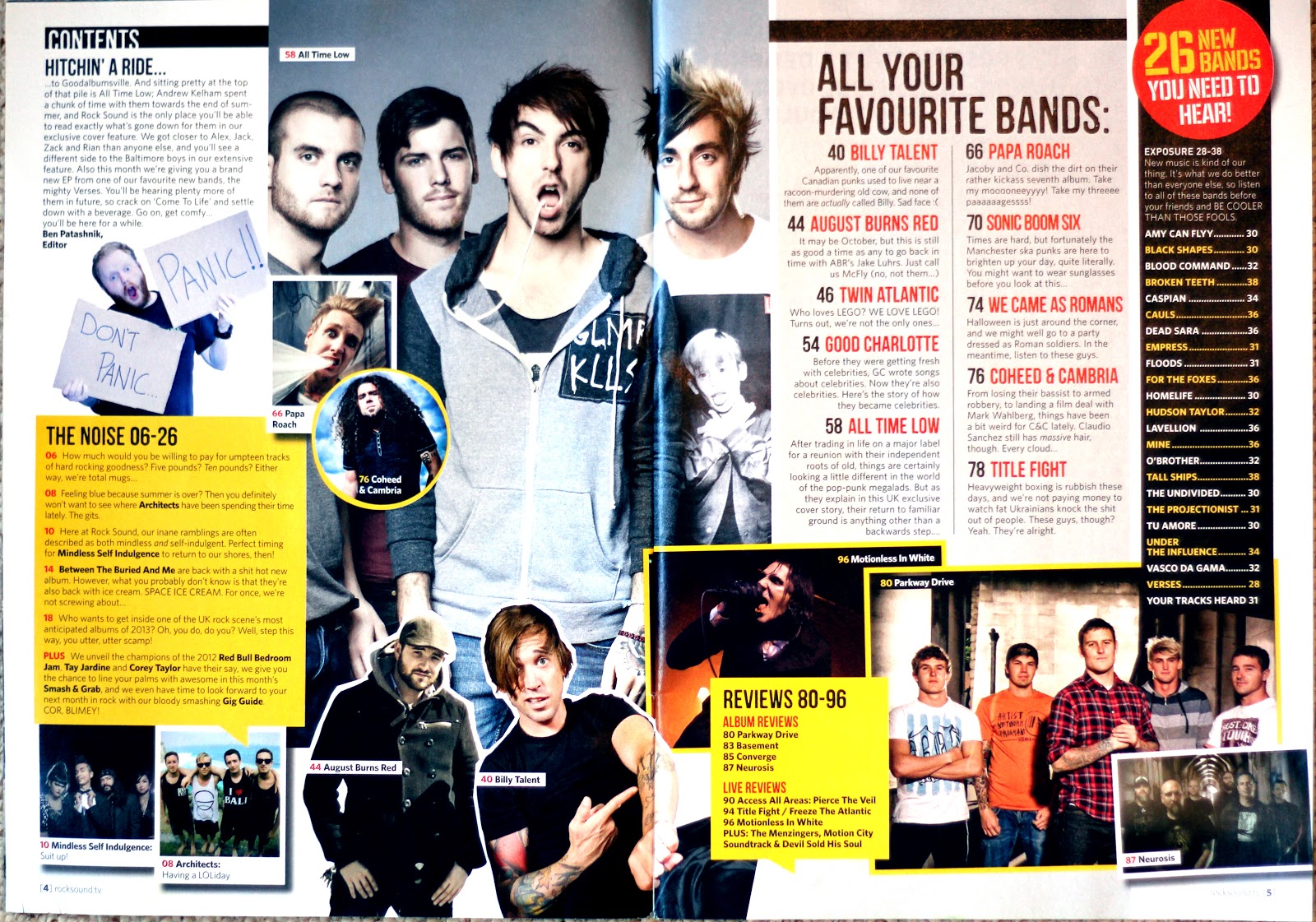
- This contents page for Rock Sound magazine also covers a double page spread. Unlike some of the other magazines it has much less structure in terms of its layout and there is lots of overlapping with text and images, giving it a ‘collage’ effect which looks laid back and casual. There are many boxing devices and different sections to present the information on these two pages, resulting in the page looking quite busy and slightly cluttered, but it is consistent with the layout from the front cover. There aren’t visible categories on this contents page, but different sections tend to have a separate style and structure.
- There is a main image on this contents page which follows on from the front cover and contains the same artist, suggesting they are definitely the main feature of this issue of Rock Sound. There are lots of other photos on this double page, some are presented in photo frames, some in square boxes and some in circular boxes. Many overlap and have been rotated at an angle, but they all link to an article and page number, engaging the reader visually and attracting them to certain areas of the magazine that are of interest to them.
- Most text on these two pages are in the same font and style, adding some consistency to the otherwise varied design. The page title itself is ‘contents’ and is surprisingly small at the top of the page, clearly not considered an important piece of information. There is also no dateline, credits or magazine title visible, instead the focus is put on the actual information. There is an editor’s letter situated in the top left corner, so if you were reading chronologically it would be the first thing you see. It is suggested that ‘All your favourite bands:’ is the category containing the main articles to attract readers, due to the fact it is the section with the largest text and most spaced out structure. Text such as ‘mooooneeyyyy!’ and emoticons are not necessarily grammatically correct to use, but reflect the casual, relaxed style of Rock Sound magazine.
- The colour scheme for this contents page does not actually seem to follow on from the front cover. The yellow theme has continued, but there is no pink or blue visible on the contents page, and no black and red on the cover. This may be that the magazine is trying to appeal to a varied audience and would be less multi-gender friendly if the pink theme continued strongly inside the magazine. On this contents page the colours help to aid the reader in identifying different sections and pieces of information, and overall is easier to understand.
Subscribe to:
Posts (Atom)