Contents page analysis - Rock Sound
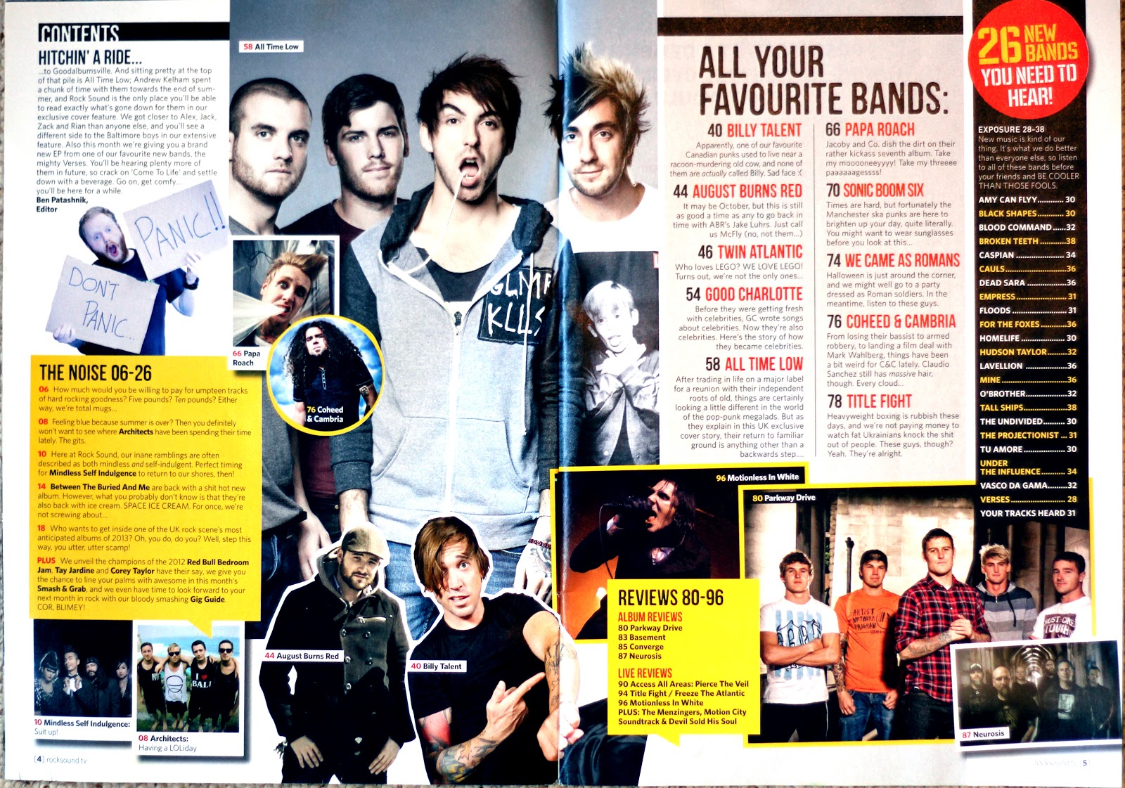
- This contents page for Rock Sound magazine also covers a double page spread. Unlike some of the other magazines it has much less structure in terms of its layout and there is lots of overlapping with text and images, giving it a ‘collage’ effect which looks laid back and casual. There are many boxing devices and different sections to present the information on these two pages, resulting in the page looking quite busy and slightly cluttered, but it is consistent with the layout from the front cover. There aren’t visible categories on this contents page, but different sections tend to have a separate style and structure.
- There is a main image on this contents page which follows on from the front cover and contains the same artist, suggesting they are definitely the main feature of this issue of Rock Sound. There are lots of other photos on this double page, some are presented in photo frames, some in square boxes and some in circular boxes. Many overlap and have been rotated at an angle, but they all link to an article and page number, engaging the reader visually and attracting them to certain areas of the magazine that are of interest to them.
- Most text on these two pages are in the same font and style, adding some consistency to the otherwise varied design. The page title itself is ‘contents’ and is surprisingly small at the top of the page, clearly not considered an important piece of information. There is also no dateline, credits or magazine title visible, instead the focus is put on the actual information. There is an editor’s letter situated in the top left corner, so if you were reading chronologically it would be the first thing you see. It is suggested that ‘All your favourite bands:’ is the category containing the main articles to attract readers, due to the fact it is the section with the largest text and most spaced out structure. Text such as ‘mooooneeyyyy!’ and emoticons are not necessarily grammatically correct to use, but reflect the casual, relaxed style of Rock Sound magazine.
- The colour scheme for this contents page does not actually seem to follow on from the front cover. The yellow theme has continued, but there is no pink or blue visible on the contents page, and no black and red on the cover. This may be that the magazine is trying to appeal to a varied audience and would be less multi-gender friendly if the pink theme continued strongly inside the magazine. On this contents page the colours help to aid the reader in identifying different sections and pieces of information, and overall is easier to understand.
No comments:
Post a Comment